Design Through the Ages
Design can take many a turn
And often causes hearts to burn
From traditional to contemporary style
Proponents of one seek to the other defile
But no matter the period age
Good examples will serve as a gauge
Of the designers’ creativity and taste
This is not a task to complete in great haste
But rather one to relish and delight
And to work on throughout day and night
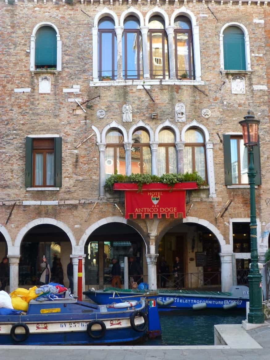
I recently returned from a quick trip to Venice to view the Venice Biennale, often referred to as the Olympics of the Art world. The Biennale takes place every 2 years and features artists from around the world who create works relating to a common theme. This years’ theme was the Encyclopedia of Knowledge and some of the works were truly extraordinary. We stayed at a typical Venetian Palazzo which featured fabulous wallcoverings of a large-scale damask silk fabric, creatively painted ceilings and interesting accessory touches. Following are pictures of this wonderful hotel and some of the design elements that make it special.

The Dining Room photo below illustrates the point of how a ceiling can make a room. Here in the USA we often paint ceilings off-white and call it a day. But, just think of the design possibilities if a ceiling was painted in a cloud pattern or cloud wallpaper was used. Or, if beams were added to a ceiling and the beams were stenciled.


Be sure to check out the cloud wallpaper patterns we have in stock!

Additional accessory touches that can also add to a room’s overall style include the use of gimp or trim to highlight wall corners or to create a border. In the illustration below the wallcovering is actually a silk damask but this can work just as well with a large-scale damask wallpaper. What a great, inexpensive design idea. Think of changing out the trim based on the season. Put up a neutral wallpaper to begin with and change its look with a seasonal swap out of trim.
Or add a corona crown and fabric drapes to make a bed standout against a patterned wallcovering.

From centuries old Venetian style to Swiss-modern. Again, the key is to use color to effect and to be willing to take design risks. The key to successful design integration is to consider what statement you want to make and then be bold in implementation. This simple Zurich-based hotel room was elevated to a fun space by the addition of a purple free-form chair and a shower stall in the middle of the bedroom–really functional as it saved on bathroom space and added an indefinable sense of whimsy.
As you prepare for the holidays think of making design changes small or large and using simple materials like wallpaper, wall borders, decals or trim to finish off a space in your own style.
Mela


